Description
Description
Sqirl is a trendy restaurant in Los Angeles, open for breakfast and lunch. Also, they produce and sell their jams, in-store and online, along with merchandise and gift cards.
My Rule as a UX Designer starts from the analysis of the entire structure of the website to delivering solutions and decisions for the design and the development based on users research.

Persona
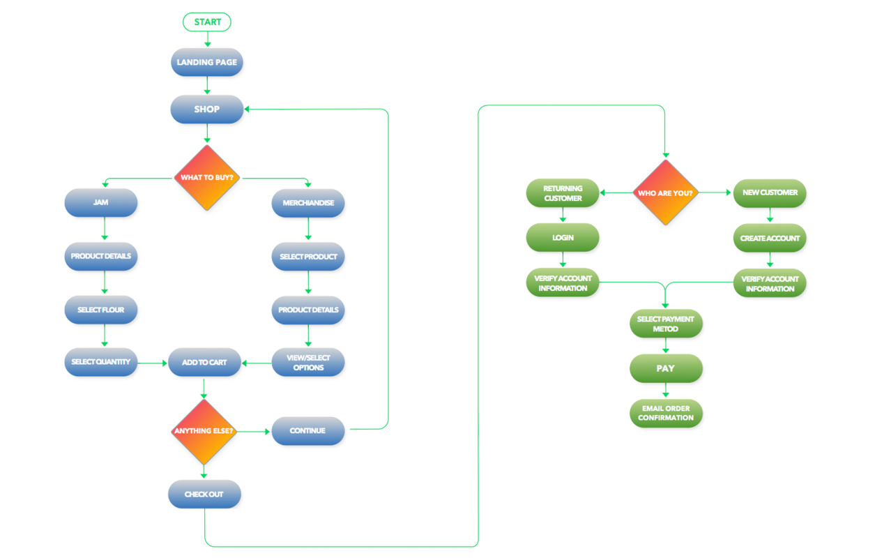
User Flow

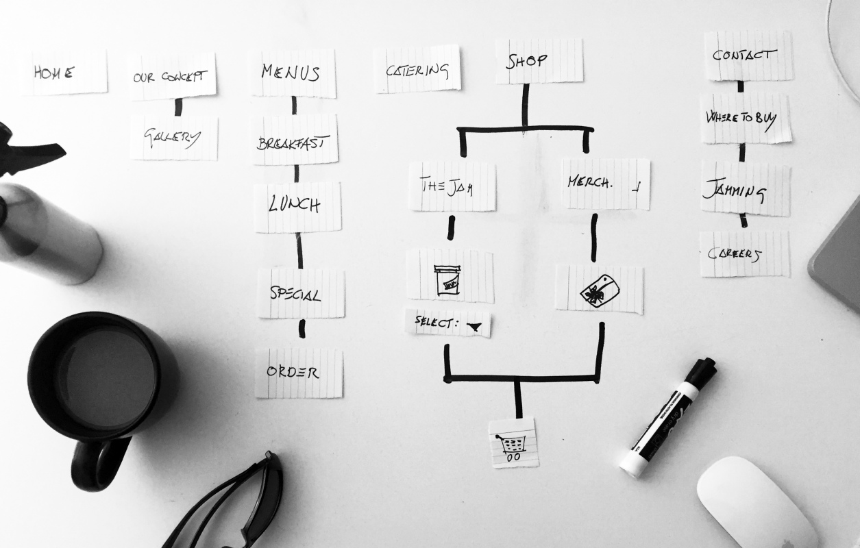
CardslSort

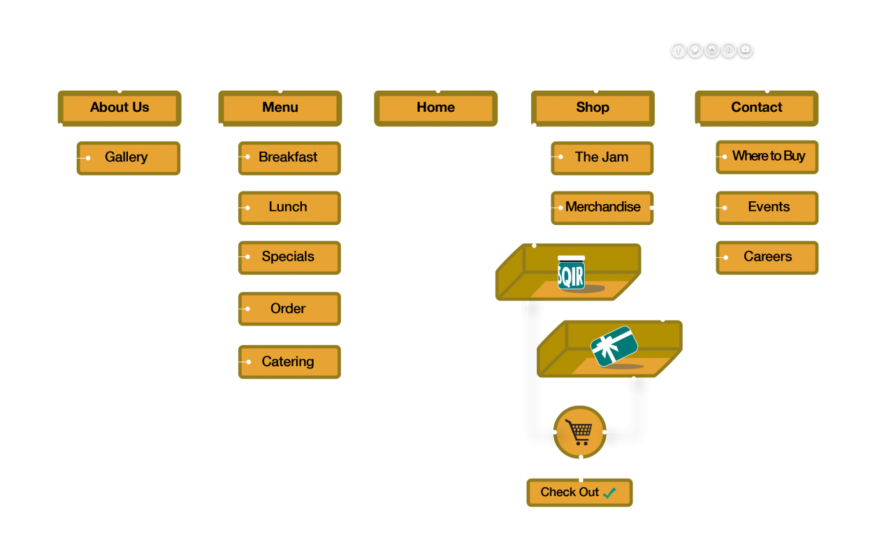
Navigation

Sketch

Wireframe

JourneyMap

C&C
 Persona
Age: 29 | Education: Bachelor degree | Hobby: Soccer, Travel, Ocean
I began research by asking users to try the purchase their jam through the website, and I’ve noticed that all have the same problems: “I can’t find the jam I like” or “this page is too long, I got lost.” Users also highlighted more issues like not understanding what’s the purpose of the website.
• Not easy to find the desired product.
• Never ending Scrolling.
• Loosing attention.
• Quick access to the products.
• Faster check out.
• Better pictures.
 Problem
Sqirlla.com need a way to improve shopping online for their products because, after performing a Heuristics evaluation, the website presented a series of technical errors and difficulties in navigating through the pages and the store. Missing attention to details and basic errors were found, like broken links. A C&C analysis highlighted more weak points: no social connection and no history (About Us) to mention a few.
Actual Website
↓
 Goal
GoalImprovement of the shopping process and redesign the website with a new style and a more friendly users flow.
The big challenge was reaching the following goals:

Better Shopping

Engaging Visual

Simplification
 Journey Map
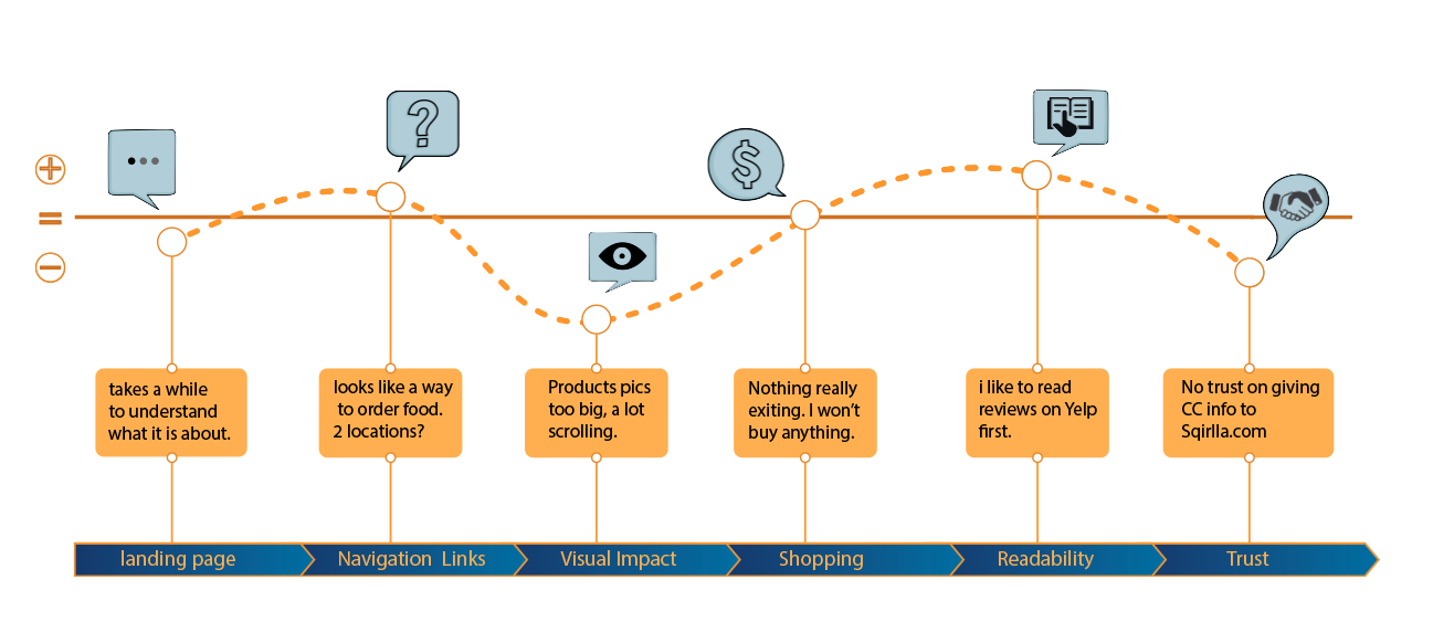
With the help of cards sorting, I’ve created new navigation, and the user flow is now smooth and simplified.


![]()
 Solution
The redesign of the website aims to enhance the overall shopping experience by incorporating more visually appealing images and improving usability. The objective is to develop a website that is more aesthetically pleasing and has a buying experience that can be made simpler by minimizing clicks and paginations from the store page to the checkout.
 Sketches
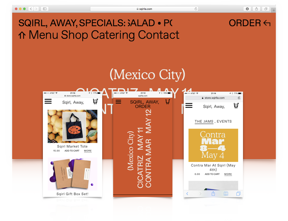
Sketching an ideal shopping page, I’ve been able to decrease drastically clicks and infinite scrolling that are the main problem on the actual website. In horizontal scrolling, the shopping page gained on accessibility to the products and a faster check out.
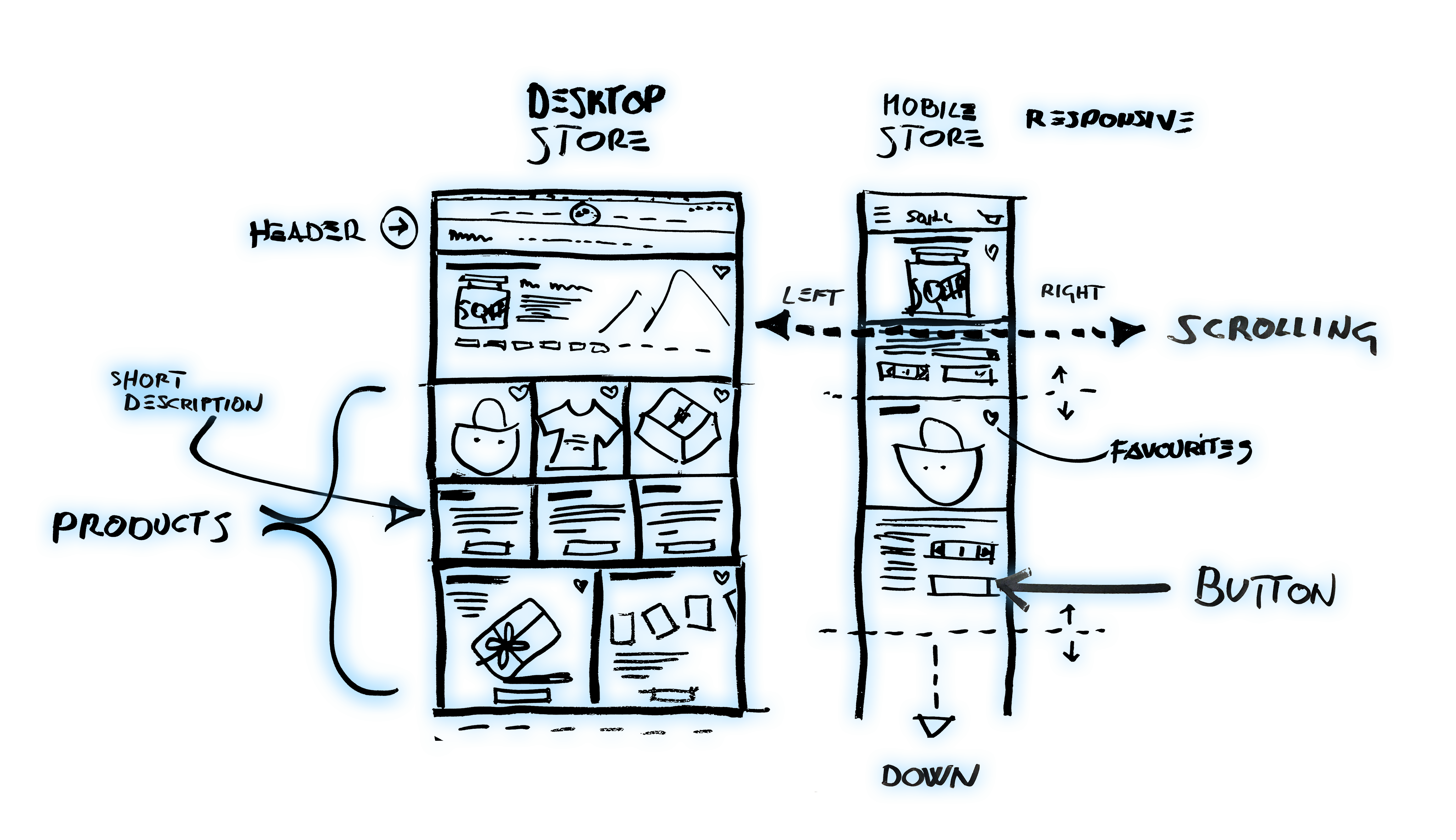
 Wireframe/High Resolution